Convenient Co
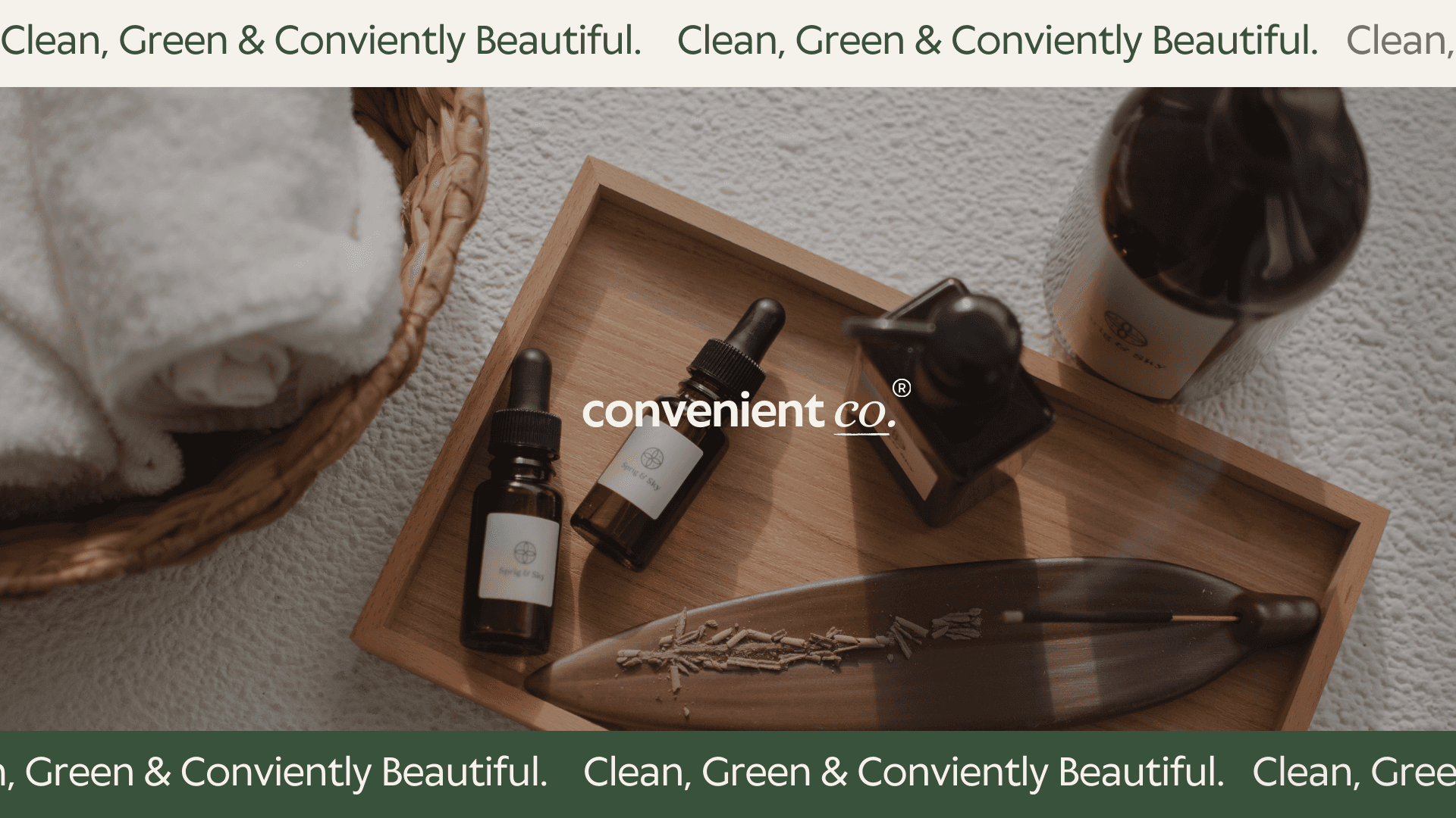
Convenient Co. is a skincare brand that blends simplicity, sustainability, and style. With a focus on earthy, organic, and neutral tones, they create products that resonate with eco-conscious consumers who value authenticity and quality. Rooted in the belief that convenience should never compromise the planet, their brand ethos is built around thoughtful design, ethical sourcing, and a commitment to natural aesthetics.
Services
B2C
Category
Retail
Client
Tara Coppalino

The Challenge
Convenient Co. needed a visual identity that resonated with its eco-conscious target market while maintaining a refined and modern feel. The challenge was to strike the perfect balance between an organic, nature-inspired aesthetic and a sense of sophistication that would elevate the brand beyond typical eco-friendly offerings.
In a competitive market flooded with sustainable brands, it was crucial for Convenient Co. to differentiate itself while staying true to its core values. Many eco-conscious brands lean heavily into rustic or overly minimalist visuals, which can sometimes lack warmth or fail to communicate a sense of everyday accessibility. The brand needed to avoid these extremes, instead creating an identity that felt both premium and welcoming.
The Solution
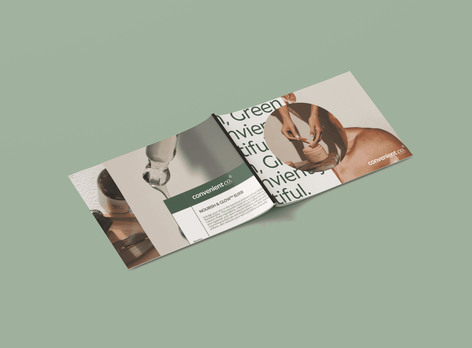
Brand Identity: Established a colour palette inspired by earth tones, paired with minimalist typography and organic textures to create a sense of warmth and authenticity.
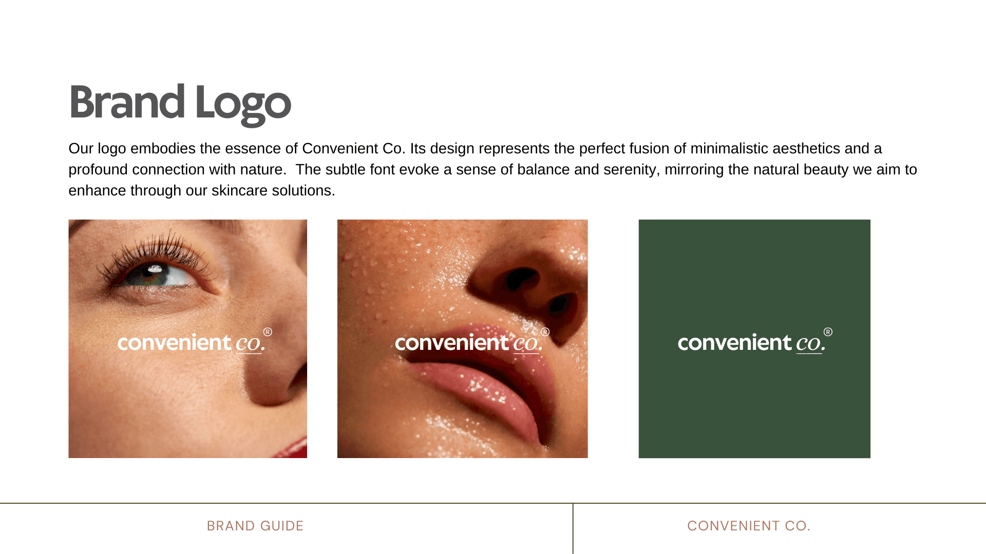
Logo Design: Crafted a clean, timeless logo with subtle natural elements to reflect the brand’s values of sustainability and convenience.
Packaging Design: Focused on using eco-friendly materials with a neutral, soft-toned colour scheme, incorporating thoughtful design elements that reinforced the brand’s message.
Taglines: Developed messaging that encapsulated the brand’s mission, ensuring consistency across all touchpoints.
This approach resulted in a brand that feels both grounded and premium, aligning with the lifestyle and expectations of its target audience.